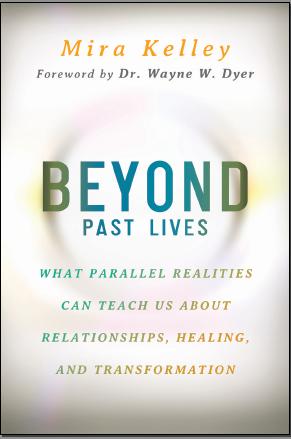
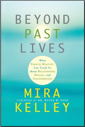
Which book cover should I pick?
I received the two possible book cover designs from my publisher, Hay House, for my upcoming book.
Seeing the book covers was so exciting! It made my book that much more real and its physical presence in the world that much more imminent.
Beyond Past Lives is coming out in July 2014. And now with your help I get to pick which book cover do I want.
Please vote below and tell me which one you want to hold in your hands and read.
Poll is Over. Thank you For Voting
You can purchase the book on Amazon
Thank you for making me part of your choosing book cover. You are truly an amazing person . We have never met but I feel your besutiful energy through your emails & it brings me a sense of peace . Dont know where its coming from . Truly looking forward to getting your book in July . Lots of love . Lana
I really love the coloring on the green one Mira. ♥
I voted for the white cover because I find it difficult to read the text on the blue/green cover.
Looking forward to reading your book!
Best regards,
Sue
I like the bluegreen cover as there is a sense of softness, like your voice in your meditation CD. By the way your CD helps me be one with the universe, I thank you so much as it is my main tool for meditation. I have not had a good regression yet, but I believe I need to raise my vibration a little more. Baby steps!
Namaste!
Mee too
Both covers are GREAT but I liked the green cover just a bit more. The green covers colors are very warm, soothing, and welcoming just like you 🙂
As soon as I saw the white cover I thought to myself, “like a drop”. Then my thoughts went to, ” what we know is like a drop in the ocean …” hope this helps. Thank you for your inspiring work Mira!
Peter 🙂
The white for me “feels” softer, lighter, and apropos to the book content I think. I love that you are asking us to help you choose. It is sweet and has an innocent charming quality.Best Pamela
I’m not exactly a professional book designer but both designs are too similar to hundreds of self-help and meta-physic books out there. I would probably opt for a more earthly tone.
Here’s a sample I just did quickly to show you. Perhaps you can talk to your designers
http://www.kugantharan.com/wp-content/uploads/2014/01/mirakelley_alternate.jpg
Hello Kugan, I am so grateful that you took the time to create this cover and show me your vision. Wow! I am sincerely moved and impressed. Thank you! Mira
Hi Mira,
Love your work and emails. Your voice has such a gentle reassuring tone and I love listening to you.
I voted for the green cover because the colors are more clear but, then I saw Kugan’s version and LOVED it. Very clear print, your name is prominent and the picture reminds me of faraway places that one may have been in past lives. The yellow circle and other text have only one color each making it easier to read. His cover is inspired! Great work, Kugan.
Totally agree! Both designs are fully digital and devoid of human expression. If I were to glance at them and not see your name as the author I may very well prejudge them as just another for-profit corporate consumable.
Just want to acknowledge the beautiful cover design you did. The other covers were very nice, I preferred the white, but I would have chosen yours! Really lovely design!
Hi Mira,
I cannot wait to read your book. I chose the white cover because I think it’s easier to read then the green one. Happy New Year!
I am a professional psychic and the green looks BLUE to me on my screen so that’s what I saw, and the information I got was that this is the one that’s more attention grabbing. So I think that’s what you want Mira. I would love to see your book in a deep almost colonial blue color.
I liked the bigger print actually, not about the color really.
I have parallel life dreams every night. I can help you. Two nights ago I was in Miami and my parents were going to buy a condo on 28th and Collins and I had a very active social life.
I love the white cover as it feels more spiritual, more lighter and softer like Pamela said. It has the effect of drawing you in. It looks better with the words “Past Lives” on the same line. And the print is easier to read. Good Luck to you Mira!
I voted for the white because it delivers more of the message written on the cover.
I liked the colors in the white cover it make it so attractive and noticeable but in the second cover I loved how the title of the book was arranged it was an eye catching hope that u can combine between the two and at the end it is ur decision and what u love and interact with more 🙂
Thank u.
I liked both, but the green one looks like a lot of other personal growth books. The white cover stands out a bit more. So, if I were in a bookstore, I think I’d choose the white cover over the green cover, all else being equal.
Thank you… for making me part of your choosing your next book cover. I anxiously await my past life regression session under your care.
XO…!
As a book designer and art director in trade book publishing for the past 25 years, may I add the following thoughts… Both covers have redeeming qualities – the white one has the more effective type treatment in that the eyes track the type in the right order of importance, the green one (which I’d rather call blue-green as true green covers famously do not sell well!) has a very beautiful, soothing color scheme.
Is the book about past lives or parallel realities? The blue-green cover speaks to the former; the white cover, the latter.
I voted for the white cover because the type design seems to tell me more about the book, but I don’t understand the background image on that cover at all. Is the ambiguity intentional? The fact that the B and D are directly interacting with it makes it important and starts the reader off with an insolvable problem. (Is it a human egg? Is it a coffee mug stain? Is it the sun?) I confess that I find it frustrating.
A thought: Has the designer tried placing that copy on the blue-green background image? (With type colors adjusted and minus the second yellow “sun” circle.) Just to see, I mean?
Forgive me if I’m over-thinking all of this. The most important thing here is that you have a book coming out soon, and you are clearly in *very* good and thoughtful hands at Hay House!
Brava, Mira!!
Hi Mira,
Congratulations for your book!
I like the green one.
The minus thing is, in my opinion, the text size used for the content.
I was thinking about a third version, using the green cover:
– the same size and colors for the title,
– your name at the bottom with the same colors but using fonts and size from the white cover
– the content should be bigger, not so small.I don’t like the way they mixed grey with blue. It will better to switch colors: subjects with blue and the words between with grey. And because the size will be bigger it can be inside of an white oval instead of circle.
All the best,
Nanett
I like the White one better, but I would like to see your name on the bottom.. Can’t wait to read it!!
Hello Mira,
I like the green one, however, I really do like what Kugan did for you. Good luck with your book, whichever way you decide.
Hello sweet Mira…
I chose the white cover for a few reasons…
The size and depth of the word BEYOND drew me in to the place of anting to go ‘Beyond’ past lives.
Also, the blurred circle draws me in…wanting to see more…to see more clearly as I go within…to open the book…
I also like that the book title on this cover is larger than your name. It feels as if all the letters on the blue-green cover are the same size and my eye does not not which is more important,,,(and I feel, at least at this point in time) that the title needs to hold more emphasis.
I also feel that the four lines beneath the title, explaining further what the book is about, is so much easier to read (and again, draw the reader in) on the white cover.
I do like the shade of turquoise green-blue on the second cover, and I think that a soft, blended shade of this at the very edges of the white cover may offer a soothing effect.
I feel honored that you have asked for our feelings about the cover dear Mira. It is such a clear reflection of the loving, generous, kind-hearted spirit you are.
Wishing you boundless blessings in this new adventure~*~*~*
With great love and appreciation for all that you are dear Mira…
Sandi
U like the green color for background with the layout of the white cover!!! I like the size and fonts on the white cover.
I voted for the white cover because the subtitle was easier to read and because it’s probably important for marketing to have the author’s and Dyer’s name positioned higher on the cover. But …. I saw what Kugan designed for the cover (see his post 1-8-14, 9:34pm), too, and actually like it best of all! In his design, the author’s and Dyer’s name are prominent, the subtitle print is larger enough to read and well-placed. And, the colorful but subdued impressionistic landscape draws you in making you wonder about where these other lives might be. Charming!
The white cover looks more intriguing and metaphysical. I definitely liked it better for your book. I tried the regression exercise and was very surprised as to what came up. Amazing.
Tha blue cover reminds the books of Brian Weiss, the white one, it’s just you with your unicity.
Looking forward to read your book.
All the best
fabrizia
Hei Mira
I vote for the white one, because the words Wyne Dyer take my atention to it quickly.
It would make me to look at the book in a bookstore if I wouldn’t know who you are 🙂
But I do, and that makes cover not so important to me.
Good luck !!!!
Hello Mira,
Very much looking forward to reading this book when it becomes available. As far as the book cover, both suggestions look nice and are nicely designed, however, I believe they both fall short of what is required. I have to agree with Kugan above. It will be lost in a sea of self help books with either of those covers.
A book cover needs to inspire a reader to seek out the wisdom of what lies within. It needs to be memorable and distinctive so that those seeking your books can pick them out of a crowded shelf. Build your brand and stay true to it. Consistency and growth are key.
Although people are growing to recognize the wisdom and understanding that you are offering, an author’s name by itself is still too risky to rely on, even if it is put out by a successful, high quality publisher. Once you have several best-selling books in circulation to your credit and have attained that necessary top-of-mind market presence, then you can rest assured of your new books success.
A book cover needs to be more then just pretty, it needs to convey meaning to your current and future readers. It is the image that speaks the first thousand words to your audience. Do not miss the opportunity to communicate that first compelling and meaningful message.
Your designer needs to have read the book and needs to have spent time with you as the author and the publisher as the marketer to identify that crucial message that grabs your target audience and speaks directly to them.
My bookshelf is crammed with those same book covers. It does not take away from the wisdom contained within them but not a one stands out at first glance. Be different, be unique, let your cover be the doorway to the wonderful things that lie on the pages within… 🙂 Cheers!!
Nice! I’d prefer the text layout of the white but not those colors.
Hello Mira
i voted for blue/green cover. The blue cover book reminds me of the images i experience during the regression session in Chicago recently. i had some images pop up during the regression ( i didn’t experience any past life other than 3-4 images), one of it was a blue cover book with some gold/yellow color rectangle pattern. So, that is the reason i choose this color.
Mira;
I like the White with your name at the top. This will be a best seller. For those of you who have not had a regression session with Mira put it at the top of your to do list for 2014. I had one with her this week and it was beyond my expectations. She is terrific, insiteful, intelligent, sensitive, with poignant thoughts and a gift for what she does. Good luck with the book.
Best regards,
Rick
CONGRULATIONS for the Book
The white cover attracts me
WHITE symbolises peace
The blurring green in BEYOND can it be pink to symbolise love ?
Gives that peaceful feeling which one gets when they listen to you
with love
I think the white one. For some reason…. the white one has a spiritual feeling behind it. I really feel some connection with it. The green one is prettier but the white one has more of an effect to me.
I find that the blue one is easier to read, violet is the colour of spirit .. I really prefer the first one !
I also really appreciate your need to share with others !
Lovely person !
I agree
VeRo
Hi Mira,
What an exciting time for you! Congratulations on making this a reality.
I must agree with Carey Rolfe’s perspective above. I’d say “Back to the drawing board guys!” I especially LOVE the picture on your website on the About Me page. It just embodies your inner glow and peace which is what happens with the knowledge of PLR information. Maybe add some blur to that background and use a white font overlay for your text.
You should not miss the opportunity to brand your face. I first found you on the Hay House World Summit, then the youtube videos. I bet I’m not alone…
Best wishes and many blessings to you!
Hello Mira,
I like the cover that Kugan designed better than the two candidates; mainly due to the placement and size of text.
Good luck!
Bill